2 Verification Practices
When it comes to statistical analysis of verification practices the Wilson Research Group functional verification study [2] [3] [4] [5] has been the main source of information for many years. While this is a good effort towards highlighting interesting industry trends, it has a number of fundamental flaws:
- It includes some but not all of the most popular open-source verification frameworks: VUnit [1], cocotb [6], OSVVM [7] and UVVM [8].
- Like any questionnaire-based study, it can’t measure what people not responding do (non-response bias). By the same token, it can only measure what respondents say they do but not what they actually do (response bias).
- The data from the study in not open, only a selected set of views is. This means that conclusions outside of those views, for example regional differences, are difficult to draw.
Keeping the data private is probably the only way to get companies to participate in such a survey and herein lays the problem. Facts, from a scientific point of view, are based on measurements that can be repeated and reviewed. This is why this repository comprises a study of open source projects in Github, and the code used to collect and present data is open to everyone. The benefits of this approach are:
- All open-source verification frameworks are present.
- There is no response bias, we see what people actually do. There can be other biases though, and we will get back to that.
- Anyone can review and comment the code in public.
- Anyone can modify the code to create the views they are interested in.
One of the views we are interested in, is the VHDL view. Most VUnit users are working with VHDL designs and verification, so that will be the focus of our first analysis.
2.1 Repository Analysis
When scanning GitHub for VHDL repositories, 1915113 VHDL files were found in 36156 repositories. These repositories were initially analyzed for two things:
- Are tests provided? This was a simple analysis just looking for VHDL files containing anything with test or tb.
- Are any of the standard frameworks used (VUnit, UVM, UVVM, OSVVM and/or cocotb)? There have been discussions regarding the use of the term “standard(ized)”; so, to be clear, we mean standard as in well-established within the community, not as in standardized.
The first analysis (see Figure 2.1) revealed that roughly 46% of all repositories provide tests for their code and that the trend is declining.
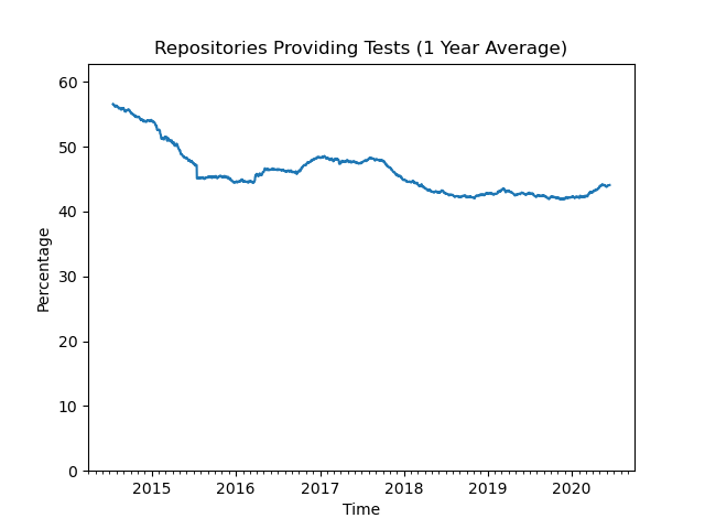
Figure 2.1: Repositories providing tests.
Just looking at the file names is not optimal. 6% of the repositories using a standard VHDL-based framework (VUnit, UVVM or OSVVM) do not use such a naming convention. However, it gives us a ballpark figure and a trend.
The second analysis (see Figure 2.2) looked at the repositories providing tests and calculated the percentage of them that are using at least one of the standard verification frameworks. This trend is increasing rapidly over the last few years.
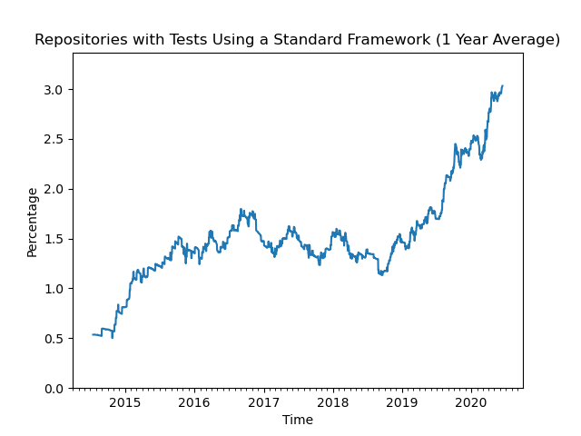
Figure 2.2: Repositories using standard frameworks.
Look at the vertical axis though. While the trend is impressive, the absolute numbers are not. Only 3% of the repositories with tests created last year use a standard verification framework.
This may come as a surprise. Many engineers working professionally with VHDL would probably say that verification is getting more and more important and that the majority is using a standard framework. Does this mean that GitHub data should be discarded as a relevent indicator for the professional world? There are at least three good reasons not to do so:
- Our beliefs are based on our experiences, and our experiences are often based on our interactions with a limited group of people. This group of people may not be a good representation of the whole VHDL community, for example due to regional differences.
- The tendency to only accept our own beliefs is called confirmation bias and is deeply rooted in the human nature. We need to be aware that it exists and try to look beyond it.
- Not all GitHub repositories are developed by professionals, but some are. We cannot expect GitHub to be a perfect reflection of the professional world but we can expect signs from that world.
In the following sections, we will dig deeper into the data to see what frameworks and combination of frameworks people are using. We will also compare those findings to the results presented in the Wilson Research Group functional verification study [4].
2.1.1 How-To
The results presented so far were compiled using the scripts presented in the following sections.
2.1.1.1 github_search.py
github_search.py is used to search GitHub for all repositories containing files of a specific language and matching a specified query. To find all repositories containing VHDL files one can specify end as the query since all VHDL files contain that key word. The result of the search is listed in text files stored in result_directory. A GitHub user name and a Github access token must also be provided to access the GitHub API.
python github_search.py \
  vhdl end result_directory \
  YourGitHubUser your_github_access_token
The GitHub API has a number of restriction on searches. One is that you cannot get the full result of the search if the result contains more than 1000 files. To handle that, every search is further restricted by the script to only target files in a limited size range. First files between 1 - n bytes are searched where n is the largest number resulting in less than 1000 files, then files in a range starting with n + 1 bytes are searched and so on until the maximum searchable file size of 384 kB has been included. The accumulated search result after every such increment is stored in a separate file in result_directory and only the last produced file contains the full result.
Occasionally there are more than 1000 found VHDL files of a single size, for example 264 bytes. In these cases some results are lost but most likely the repositories containing those missing files have other VHDL files caught in another search increment; so this will not have a significant effect on the overall statistics.
The GitHub API also has rate limitations, which means that searches with many results take a long time to complete. Searching for all VHDL files takes days but the more limited searches for specific verification frameworks that we will use later can complete in minutes. If you interrupt a longer search and restart it later github_search.py will look at the intermediate result files in result_directory and continue from where it was interrupted.
The result from the latest search for all VHDL files is found in all_vhdl_repos.txt
2.1.1.2 github_clone.py
github_clone.py makes a clone of all repositories listed in a file such as those produced by github_search.py (2.1.1.1). The clone is sparse and only contains VHDL, SystemVerilog and Python files, which are the ones used for this study. The sparse clone is also stripped from its .git directory, and zipped to save storage space. The script also stores some basic information about the repository.
A call to the script looks like this:
python github_clone.py \
  repository_list result_directory \
  YourGitHubUser your_github_access_token
If repository_list contains a repository foo/bar, the script will create a directory foo under result_directory and in that directory the zipped repository as bar.zip. The basic repository information is stored in a JSON file named bar.basic.1.json.
Cloning all VHDL repositories from GitHub takes several days and requires about 180 GB of storage. Due to that size, it has not been possible to share the data. Anyone interested in analyzing those repositories needs to recreate the data locally, using this script and the all_vhdl_repos.txt repository list.
2.1.1.3 analyze_test_strategy.py
analyze_test_strategy.py analyzes the cloned repositories and generates the statistics presented in this work. The initial search for repositories using any of the standard frameworks is automatic but also produces a number of false positives that must be removed manually:
- A repository with both VHDL and (System)Verilog files that is also using UVM or cocotb may not use these frameworks to verify the VHDL code. VUnit can also be used for (System)Verilog verification but the search script can distinguish and ignore such repositories to avoid false positives.
- Sometimes the main design being verified is based on (System)Verilog but it also includes third party IPs written in VHDL. This is considered a false positive since the IPs are not the target for the verification and the design language of choice is not VHDL.
- Some repositories have testbenches based on a standard framework but the purpose is not to verify VHDL code but rather to use the code for testing an EDA tool being developed. A parser for example.
- This study is focused on the users of the frameworks, not the developers. The repositories hosting the frameworks and copies of these repositories have been excluded.
The false positives are listed in fp_repos.json.
The script will produce a JSON file for each analyzed repository (repo_name.test.2.json) and also a summary JSON file. The name of that file is given in the call to the script
python analyze_test_strategy.py \
  path/to/directory/with/cloned/repositories \
  path/to/analysis_summary.json \
  --fp fp_repos.json
2.1.1.4 visualize_test_strategy.py
visualize_test_strategy.py creates the figures used in this post from the results generated by analyze_test_strategy.py (2.1.1.3). The figures are saved to the output directory given in the call.
python visualize_test_strategy.py \
  path/to/analysis_summary.json \
  path/to/github_facts/root/repo_classification.json \
  path/to/output/directory
2.2 Frameworks
In total, there are 281 repositories using a standard framework. Figure 2.3 shows the number of repositories using each framework, and how more than one are used in some of them. Note that using several frameworks in the same repository doesn’t necessarily mean that they are used for the same testbenches. This diagram doesn’t make that distinction.

Figure 2.3: Number of repositories using one or several frameworks.
Note: Drawing area proportional Euler diagrams is hard and the R package we used (eulerr) didn’t quite make it. In these situations, the missing groups are listed below the diagram. In this case it failed to include two repositories using all three of VUnit, OSVVM, and UVVM.
From this diagram we can see how frequently the different frameworks are used, by just counting the number of repositories and to what extent they are used together. One of the more notable facts is that UVM isn’t the dominating framework, as concluded in the Wilson study [4] (from now on called WS). However, there are several important differences between WS and this GitHub study (from now on called GS). One is that WS has professional participants only, but the diagram above includes repositories developed by professionals as well as people from Academia.
To make GS more comparable with WS, all repositories need to be classified as being professional, academic or unknown (if failure to classify). This was done by looking at the contributors to each repository. To classify the contributors as professionals or from academia, GitHub user profiles and Git logs were looked, the usernames were searched through Google and searched on social platforms like LinkedIn. With that information, the following criteria was used:
- A repository with contributions from professionals is classified as a professional repository. Academic work is sometimes done together with the industry, which means that there is a professional interest for that work. That is the reason for not requiring all contributors to be professionals in order to classify the repository as professional. Also note that we’re not suggesting that professionals publish their professional work on GitHub. What we’re measuring is their practises. The assumption is that these public practises reflect what they do professionally. This assumption will also be tested statistically when we compare the results from WS and GS.
- A repository with no contributions from professionals, but with contributions from academia, is classified as an academic repository.
- If all contributions are made by users with unknown background, the repository is classified as unknown.
- A repository with contributors that are professionals today, but not at the time of their contributions, is not classified as professional.

Figure 2.4: Number of professional repositories using one or several frameworks.
The distribution of professional repositories, which is shown in Figure 2.4, looks a bit different compared to the overall view in figure 2.3, but UVM is still not dominating. Another notable observation is how frameworks are used in combination:
- Most repositories using more than one framework use VUnit and OSVVM.
- More than half of the repositories using OSVVM also use VUnit.
- UVM is not combined with any other framework.

Figure 2.5: Number of academic repositories using one or several frameworks.
The academic view is shown in Figure 2.5. There is less mixing of frameworks in Academia, and this is what we would expect. With less experience, there is less time to try the different alternatives and find the successful combinations.
| UVVM | VUnit | cocotb | OSVVM | UVM |
|---|---|---|---|---|
| 0 | 3 | 1 | 5 | 6 |
For completeness, the number of unknown repositories should also be analyzed (see Table 2.1). The numbers are big enough to create an uncertainty about the precedence between cocotb, OSVVM, and UVM in previous diagrams; but they are not significant enough to change the bigger picture. VUnit is the most commonly used verification framework for VHDL repositories on GitHub.
While some insights were shown on how verification frameworks are used on GitHub, the unexplained differences between WS and GS remain. There are three more possible explanations that need to be investigated further:
- GS is focused on VHDL repositories, while WS includes both VHDL and (System)Verilog projects.
- WS was conducted in 2018 while the GitHub data originates from June 2020.
- In this section, the number of repositories was analyzed, and not the number of users. This is misleading because a single user can have several repositories and a single repository can have many contributors. WS presents percentages of design projects and would suffer from the same problem. However, we don’t think they have that data. Looking at the newly released 2020 survey (results are yet to be published) there are no questions that allow them to determine if two survey participants are working on the same project or not. Most likely they are counting users.
To get a deeper and more accurate understanding of the GitHub data, in following sections we will continue analyzing the Git history of these repositories and finding the number of users for each framework. The Git history will also reveal how the framework usage has changed over time.
2.2.1 How-To
The statistics and Euler diagrams presented in this section were produced by the previously mentioned analyze_test_strategy.py (2.1.1.3) and visualize_test_strategy.py (2.1.1.4) scripts. The classification of repositories is provided with repo_classification.json which is input to the visualize_test_strategy.py script.
2.3 Users
The user analysis is done by analyzing all commits to the files using a standard framework. Every commit author from the time the framework was introduced in the file and forward is logged as a user of that framework. Each user is classifed according to:
- A user that has committed to a professional repository is considered to be a professional user. Note that the user can be a student, but if there are professionals involved in the same project that student is considered to be working at a professional level.
- A user that is not at a professional level but has commits to an academic repository is classified as being an academic user.
- All other users are classified as unknown.
The list of users has also been checked for aliases. Two commit authors are consider to be the same user if:
- They have the same email address and that address isn’t a common default address such as
user@example.com. - The user names are very similar. This is a judgement call but that judgement was aided by using the Levenshtein distance as a metric for the similarity between strings. The result of that analysis can be found in
user_aliases.json.
Figure 2.6 shows the total number of users having experience with each framework. Looking at users rather than repositories (see Figure 2.3) doesn’t have a drastic effect to the overall picture. VUnit is still the most commonly used verification framework on GitHub.

Figure 2.6: Number of users using one or several frameworks.
Using the timestamp for each user’s first commit allows to see how the situation depicted in Figure 2.6 evolved over time. This is shown1 in Figure 2.7 (download video from total_user_bar_race.mp4).
Figure 2.7: Number of users over time.
A further breakdown of the users based on classification is shown in Figures 2.8, 2.9 and 2.10.

Figure 2.8: Number of professional users using one or several frameworks.
The same conslusions made for professional repositories still hold when analyzing professional users:
- Most professional users using more than one framework use VUnit and OSVVM.
- More than half of the professional users using OSVVM also use VUnit.
- UVM is not combined with any other framework.

Figure 2.9: Number of unknown users using one or several frameworks.
The portion of unknown users is the same as the portion of unknown repositories (5%) and they do not affect the main conclusions.

Figure 2.10: Number of academic users using one or several frameworks.
The academic view is a bit different from the corresponing view for repositories (see Figure 2.5) in that the relative portion of VUnit users is higher. There are more academic VUnit users than users of the other frameworks combined. More research is needed to fully explain the differences between professional and academic framework usage but some insight can be gained by comparing the professional and academic trends as shown in Figures 2.11 and 2.12.

Figure 2.11: Number of professional users over time.

Figure 2.12: Number of academic users over time.
Overall the trends are stable or slowly changing with one notable exception. There is a drastic change in the number of academic VUnit users in early 2018. It’s always good to keep an eye on anomalies in the data. Are the numbers we see the result of a longer stable trend or caused by a special event? In the next section we will look deeper into this temporal anomaly and find its root cause. We will also look for spatial anomalies by examining the timezones from which the users operate. That will allow us to examine whether the trends we see are global or the results of local hotspots.
2.3.1 How-To
2.3.1.1 analyze_users.py
analyze_users.py makes a clone of all repositories using a standard framework, according to repository statistics (repos_stat.json) created by analyze_test_strategy.py. Unlike default github_clone.py use, git histories are preserved and repositories are not compressed. Furthermore, user statistics are extracted by scanning the Git history of all repositories, unlike the repository classification (repo_classification.json) and the list of user aliases (user_aliases.json).
The script produces a JSON file for each analyzed repository (repo_name.user.1.json) and also a summary JSON file. The name of the output file is given in the call.
python analyze_users.py \
  path/to/directory/with/cloned/repositories \
  path/to/repos_stat.json \
  path/to/repo_classification.json \
  path/to/user_aliases.json \
  path/to/user_stat.json
The result of our latest run is provided in user_stat.json.
2.3.1.2 analyze_sample.py
The analysis of standard framework users also includes a comparison with the whole group of VHDL users on GitHub. This comparison is futher described in the next section. The VHDL users are collected from a random sample of VHDL repositories listed in sample_repos.txt. The sample repositories are first cloned using github_clone.py with the --no-zip option set to prevent repository compression. Next, the analyze_sample.py script is called to create a JSON file with the analysis result.
python analyze_sample.py \
  path/to/directory/with/cloned/sample/repositories \
  path/to/sample_user_stat.json
2.3.1.3 visualize_users.py
visualize_users.py creates the images and the video clips used in this post from the results generated by analyze_users.py and analyze_sample.py. The images and videos are saved to the output directories given in the call.
python visualize_users.py \
  path/to/user_stat.json \
  path/to/sample_user_stat.json \
  path/to/image_directory \
  path/to/video_directory
2.4 Anomalies
The explanation for the VUnit temporal anomaly seen in Figure 2.12 is to be found in the Elementos de Sistemas course offered by the Brazilian Insper Institution. The students of that course used VUnit for their work and also provided the results on GitHub.
The Brazilian connection to this anomaly raises a more general question: are the trends we see global trends or just strong local trends? Git can actually provide insights to that as well, since each Git commit also logs the timezone of the committer.
To set a reference, we start by analyzing how VHDL users are distributed around the globe. Figure 2.13 was created by analyzing all VHDL commits in a random subset of all the VHDL repositories on GitHub. This subset contains 2000 repositories and slightly more than 2500 users.

Figure 2.13: VHDL users by region and timezone.
With 27 timezones, the image is rather scattered. It is also a bit distorted, since locations using daylight saving time will occupy two timezones during a year, while those not using daylight savings time occupy one. To get a feel for the bigger picture, we have identified three larger regions: (North and South) America; Europe and Africa; and Asia and Australia. The vertical arrows at the top of the region bars represent the 95% confidence intervals for these numbers.
The european/african region has 44% of the users, which is sligtly more than the american region (41%). However, the confidence intervals of the two regions overlap, meaning that the order between the two regions isn’t statistically significant. On the other hand, the asian/australian region is, with 15% of the users, significantly smaller than two other regions. Note that this may not represent the real distribution of VHDL users in the world, since there can be regional differences in open source involvement. However, that potential bias is not important for this study. What’s important is that a framework with an even global adoption should have the given distribution among the regions. Figure 2.14 shows that this is not the case.

Figure 2.14: Framework users by region and timezone.
The numbers given in Figure 2.14 are the actual numbers on GitHub after a full scan for all standard framework users. From that point of view, the result is exact without any confidence interval. However, we’ve assumed that GitHub is representative for some larger group of users which results in the given confidence intervals. What that larger group of users is will be discussed later in this paper.
By comparing the confidence intervals in Figure 2.14 with those of the reference distribution in Figure 2.13 we can distinguish three different cases:
- The confidence interval for a region completely overlaps that of the reference distribution. This is marked with green arrows.
- The confidence interval for a region do not overlap that of the reference distribution. This is marked with red arrows.
- The confidence interval for a region partially overlaps that of the reference distribution. This is marked with blue arrows.
Based on this classification we can draw some conclusions:
- All confidence intervals for UVM are green. This means that the UVM distribution is consistent with an even global adoption of the framework.
- VUnit and OSVVM have no GitHub users in Asia/Australia and this under representation is significant. Note that also UVVM has no users in that region, but with fewer overall users the confidence intervals are larger and significant conclusions are harder to draw.
- As shown in Figure 2.13, America and Europe/Africa regions are similar in size. OSVVM and UVVM deviate from this with significantly more users in Europe/Africa while America is significantly under represented.
In the next section, we will derive confidence intervals for all results in this study, as well as the results from WS. This will allow us to conclude where the studies are consistent with each other and where they are significantly different.
2.5 Wilson Study Comparison
The Wilson study is performed every even year, but it also asks the participants for their plans for the next year. Based on this, we can create statistics for both odd and even years. Figure 2.15 shows the framework usage for the years 2018 - 2020 ([4] [5]).

Figure 2.15: Framework users according to the Wilson Study
In addition to the percentage numbers, Figure 2.15 also contains the 95% confidence interval for each measurement. Using the method of overlapping confidence intervals, we can see few significant changes between 2018 and 2020. Only the increase in the number of RVM users is a statistically established trend.
The Wilson and GitHub studies focus on different sets of frameworks, which limits what can be compared. UVM, OSVVM, and UVVM are comparable; but, can the Python-based solutions measured by the Wilson study be compared to the cocotb and VUnit measurements in the GitHub study? Unfortunately, we cannot, and there are a number of reasons for that:
- The Wilson study asked the participants if they are using a “Python-Based Methodology (e.g., cocotb, etc.)”. The problem with that question is that we cannot know if that category contains only cocotb users, non cocotb users, or something in between.
- cocotb is Python-based, while VUnit is not. VUnit is based on VHDL and SystemVerilog testbenches but uses Python for automating the HDL-external tasks of a testing flow. VUnit is Python-aided rather than Python-based, and it’s unclear how VUnit users responded to this question.
- Participants using frameworks not among the predefined choices tend not to tick the “other” option. This was noted in Wilson Study 2016 [3] and can also be seen in Figure 2.15. The “other” category contains 5-6% of the participants in the data from 2018 and 2019 [4]. This is where we would expect to find the users of Python-based methodologies. When Python became a separate category in 2020, it got a 14% of the users [5]. We would expect such a significant portion to be shown as a drop in the “other” category, but instead we see an increase to about 9%.
- The Wilson study also asks what verification and testbench languages are being used. Among the ASIC projects, 27% answered that they use Python for verification and testbenches, but only 11% use a Python-based methodology. This shows a difference between Python-based and Python-aided, but it’s unclear how many participants make that distinction.
Going forward, we will compare the two studies with respect to UVM, OSVVM, and UVVM.
Before we can compare the studies, we also need to compensate the differences in what’s being measured. The Wilson study measures the framework usage in FPGA and ASIC projects. When combined, yields the statistics in Figure 2.15. The GitHub study, on the other hand, only measures framework usage for VHDL designs. The VHDL statistics are not provided directly by the Wilson study, but are estimated using the following approach.
- OSVVM and UVVM are targeting the VHDL community, while the other frameworks target both VHDL and (System)Verilog. It is certainly possible to verify a (System)Verilog design with OSVVM and/or UVVM, but it is assumed to be rare; thus, it can be ignored. With this assumption, all OSVVM and UVVM users in Figure 2.15 are also verifying VHDL designs.
- The Wilson study provides the total number of study participants, as well as the number of participants verifying VHDL designs. Based on the assumption above, we can use this information to calculate the number of users using frameworks other than OSVVM and UVVM to verify VHDL designs. We also assume that the relative portions of the other frameworks are the same as in Figure 2.15.
- The sum of the percentages in Figure 2.15 is more than 100% because some users use more than one framework. We assume that this sum remains the same.
Using this approach, we get the result shown in Figure 2.16. The numbers have also been normalized to sum 100%.

Figure 2.16: Framework users for VHDL designs according to the Wilson Study
The results in Figure 2.16 can be compared with the GitHub study. The results for 2020 are shown in Figure 2.17.

Figure 2.17: Comparison between the Wilson and GitHub studies
Since the confidence intervals for each group of framework users does overlap between the studies, there is no statistically significant difference between the two. However, judging significance by looking at overlapping confidence intervals comes with a number of problems:
- The method is not exact. There can be significant differences despite a small overlap in the confidence intervals. The better approach is to calculate the confidence interval for the difference between the measurements. If zero is outside of that confidence interval, we can say that there is a significant difference.
- Even with a more exact confidence interval, we cannot look at the frameworks independently since they must sum to 100%.
For these reasons, we are going to derive a single metric for judging the similarity between the two studies. We are going to assume that the two studies are based on a random set of users taken from the same population (null hypothesis). With that assumption, we can use the multinomial distribution to calculate the probability for each of the two study results. We can also calculate the combined probability by taking the product of the study probabilities. If the combined probability is among the 5% least probable of all possible results when we do a pair of studies, we say that there is a significant difference and the assumption must be incorrect (null hypothesis is rejected).
We don’t know the true distribution of users in the population, but we can estimate it using the most probable distribution given the two study results we have. This is known as maximum likelihood estimation, and we find the optimum if we combine the participants of the two studies. The result is shown in Figure 2.18.

Figure 2.18: Wilson and GitHub studies combined
The result of the combined study is closer to the Wilson study. Yet, that is expected since the Wilson study has a larger sample size and large deviations are less likely.
With the distribution estimate, we can calculate the probability for all 1.4 billion possible pair of study results given the sample sizes we have. The accumulated probability for the study outcomes less likely than the original study combination is 22.5%. About one in four studies will have a result less probable than what we see. For that reason we cannot reject the null hypothesis that the Wilson and GitHub studies are sampling from the same population.
Not being able to reject the null hypothesis doesn’t mean we have proven that the two populations are without differences. There may exists null hypotheses which assumes that there is a relative bias but still give a higher similarity. In the following section we will examine some plausable biases and how they affect the similarity.
2.5.1 Temporal Bias
The GitHub study presents data accumulated over time while the Wilson Study presents data from a specific point in time (mid 2020). This is a problem since we cannot determine if a GitHub user of an specific framework is still a user today. A user that made the last framework-related commit 5 years ago may still be using that framework outside of GitHub but a user that made the last commit 5 days ago may have decided to stop using that framework. However, the more recent the last commit, the more likely the user is still an active user.
Examining a limited and recent time period on GitHub gives more confidence about data only containing active users. However, with a shorter time span we will also decrease the number of study participants, which lowers the statistical power. Also, unless we can show that there is a significant difference between recent and past data, we can’t confidently exclude the possibility that any difference we see is caused by chance alone.
Figure 2.19 shows a comparison between all, past, and recent GitHub users with the latest Wilson study. Past users are those who made their last commit before the previous Wilson study in mid 2018 and the recent users are those that made their last commit after that point in time.

Figure 2.19: Temporal bias analysis in mid 2018
Compared to the overall GitHub data, the more recent data has a higher portion of UVVM users which is more consistent with the Wilson study and the similarity has increased to 75%. At the same time, the similarity between the past and recent GitHub data is low, 3.2%. We can also see that the confidence intervals for the recent data is wider than for the overall GitHub data. As a measure for the overall uncertainty we can sum all confidence intervals and express the sum as a percentage of the total number of users. The uncertainty for the overall GitHub data is 52% while it’s 72% for the recent data. More insight into these numbers can be gained by analyzing how they depend on the date separating past and recent GitHub data. This is shown in Figure 2.20.

Figure 2.20: Temporal bias analysis
In general we can see that recent data has a higher similarity to the Wilson study than the overall GitHub data. The similarity in the most recent data is lower than the peak but that time span is also associated with an accelarating uncertainty as the number of inlcluded users goes down. When the separation between past and recent data is set to be early 2018 or later we also have a consistently low similarity between the two data sets which indicates that the separation is meaningful. Setting the separation date at mid 2018 doesn’t yield the highest Wilson similarity. Yet, it’s in the higher region and has some margin to the where the uncertainty starts to accelerate rapidly and where the similarity to the past data increases. For these reasons we will exclude GitHub data before mid 2018 when comparing with the Wilson study.
2.5.2 Regional Bias
Another possible bias is how the study participants are distributed between the regions of the world. The Wilson study noted that:
(…) the 2020 study demographics, as shown in fig. 2, saw an 11 percentage points decline in participation from North America but an increase in participation from Europe and India.
For concluding that there is a bias in the distribution between regions, we want to exclude the possibility that there is a bias within the regions themselves. The Wilson study doesn’t provide detailed data in this area but the presentation for the study included data for FPGA users in Europe as an example of regional differences. We can extract the VHDL related data using the previously described method and then compare with the GitHub data for the European and African timezones. The result is shown in figure 2.21.

Figure 2.21: Wilson and GitHub comparison for Europe
The match is almost perfect with a similarity of 99.9% but this comparison is not ideal since the GitHub study cannot separate:
- the European users from African users.
- the FPGA users from the ASIC users.
With these problems in mind, and without Wilson measurements for the other regions, we need another method for evaluating regional bias. One such approach is to artificially bias the GitHub study and examine how that affects the similarity when comparing with the Wilson study. We do this by weighing users differently depending on their origin. For example, each user from Europe can be counted as 1.2 while users from other regions are counted with a value less than one to create a bias towards Europe. Figure 2.22 shows the result of this approach. Each point represents a study biased to have a specific portion of the participants from each of the regions. Note that the portion of users from Asia/Australia is given implicitly from the portion of the users from the other regions as given by the x and y axes.

Figure 2.22: Wilson and GitHub studies with bias
The blue point in figure 2.22 marks the unbiased GitHub study. We can improve the 75.3% similarity by moving in the direction of fewer American users which is consistent with the decline noted in the Wilson study. The Wilson study also noted that the loss of American participants was mostly compensated with an increase of participants from Europe and India. However, while Indian participation increased, it also dropped in East Asia leading to a relatively small overall increase of 2% in Asia. This is not consistent with the GitHub data in figure 2.22. In order for the similarity to increase, the American participation drop must be compensated with an increase of Asian/Australian participation and an unchanged European/African participation.
We can also compare the Wilson data from the 2018 study, before the decrease in American participation, with the recent GitHub data of that time. Are the studies more similar with an increased Wilson study participation from North America? Figure 2.23 shows that this is no the case. The similarity in 2018 was actually lower but the difference isn’t large enough to indicate anything but normal fluctuations caused by the uncertainty at hand.

Figure 2.23: Temporal bias analysis
Our conclusion is that the decrease in North American participation in the Wilson study isn’t significant to the comparison with the GitHub study.
2.5.3 Classification Bias
Figure 2.24 shows how the Wilson study compares with recent academic and professional users of the GitHub study.

Figure 2.24: Wilson and GitHub studies compared
We see that the academic subset is very similar to the Wilson study with a similarity of 99.9% while the professional subset is very different with a similarity of 1.6%. This raises a number of questions. What do we know about the user classification in the Wilson study and why are the GitHub professional and academic subsets so different?
The high similarity between the Wilson study and the academic GitHub users is not itself a surprise. We can expect academic users to have less experience in general but that is more related to how tools are used rather than what tools are used. The cooperation between EDA vendors and the universities will also give professional influences when it comes to choosing the right tools for verification.
The participants in the Wilson study were selected to represent a broad set of design markets and regions. Given that information and the fact that the major EDA companies have programs reaching tens of thousands university students, we can expect a mix of academic and professional participants. There is no public information about that mix but we find it unlikely that the difference with the professional GitHub subset can be explained by a very high percentage of academic users in the Wilson study. It is the deviation of the professional GitHub subset that requires extra analysis.
Looking at past similarity numbers we see that they are highly volatile. The 1.6% in 2020 was 79% in 2019 and 26% in 2018. We can also get a more high-resolution view by studying the similarity between the academic and professional GitHub data. This is shown in figure 2.25. Note that even though the GitHub academic subset is almost identical to the Wilson study in 2020, the similarity between the GitHub academic and professional subsets is higher than the similarity between the Wilson study and the GitHub professional subset. The reason is that the academic subset has a smaller sample size than the Wilson study and that makes larger differences more probable.

Figure 2.25: GitHub academic and professional subset simularity
The absense of stability in the similarity suggests that the low similarity found in 2020 is largely caused by chance and not by any bias. For that reason we’ve kept the professional data in the comparison with the Wilson study.
2.5.4 Combining the Studies
By removing bias to make the studies comparable we are also in a position where the studies can be combined. A combined study broadens our knowledge when the studies measure different things and it increases the statistical confidence for the things measured by several studies. This latter effect is due to the increased sample size.
In this case, the results of the Wilson study are broaden by adding data for VUnit and cocotb from the Github study. The statistical confidence increases for UVM, OSVVM, and UVVM which are included in both studies.
Figure 2.26 shows the two studies combined. It was created by taking the relative sizes between the VUnit/cocotb group and the UVM/OSVVM/UVVM group from the Github study. The relative sizes of the frameworks in the latter group were calculated by combining the data from the two studies.

Figure 2.26: Full GitHub and Wilson study comparison
The data shows that the frequency of OSVVM and UVVM users are indistinguishable but significantly lower than the number of cocotb and UVM users. The frequency of cocotb and UVM users are also indistinguishable but significantly lower than the number of VUnit users.
2.5.5 How-To
wilson.py provides all the results related to the comparison with the Wilson study. The script is called without any arguments.
python wilson.pyReferences
[1] L. Asplund, O. Kraigher, and contributors, “VUnit: a unit testing framework for VHDL/SystemVerilog,” Sep. 2014. http://vunit.github.io/.
[2] Wilson Research Group, “Functional Verification Study,” Jan. 2015. https://blogs.mentor.com/verificationhorizons/blog/2015/01/21/prologue-the-2014-wilson-research-group-functional-verification-study/.
[3] Wilson Research Group, “Functional Verification Study,” Aug. 2016. https://blogs.mentor.com/verificationhorizons/blog/2016/08/08/prologue-the-2016-wilson-research-group-functional-verification-study/.
[4] Wilson Research Group, “Functional Verification Study,” Nov. 2018. https://blogs.mentor.com/verificationhorizons/blog/2018/11/14/prologue-the-2018-wilson-research-group-functional-verification-study/.
[5] Wilson Research Group, “Functional Verification Study,” Nov. 2020. https://blogs.sw.siemens.com/verificationhorizons/2020/10/27/prologue-the-2020-wilson-research-group-functional-verification-study/.
[6] C. Higgs, S. Hodgson, and contributors, “Coroutine Cosimulation TestBench (cocotb),” Jun. 2013. https://github.com/cocotb/cocotb.
[7] J. Lewis and contributors, “Open Source VHDL Verification Methodology (OSVVM),” May 2013. https://osvvm.org/.
[8] E. Tallaksen and contributors, “Universal VHDL Verification Methodology (UVVM),” Sep. 2013. https://uvvm.org/.
Animations/videos for each of the categories are available in the repo. See
video/*_user_bar_race.*.↩